We design dashboards and periodic reports around how your team reads the market — not around whatever template the terminal defaults to.
A market data terminal gives you forty panels, most of which you do not use. An internal spreadsheet gives you the three charts you actually care about — but they break every time the source moves, and nobody outside the author can open them. There is a gap between those two states, and most institutions sit in it.
Our reporting service fills that gap. We design and build deliberate visualisations: a small number of panels that answer the specific questions your investment committee, risk team or operations group asks each week — with consistent formatting, documented data sources, and a refresh mechanism that does not rely on one analyst's macros.
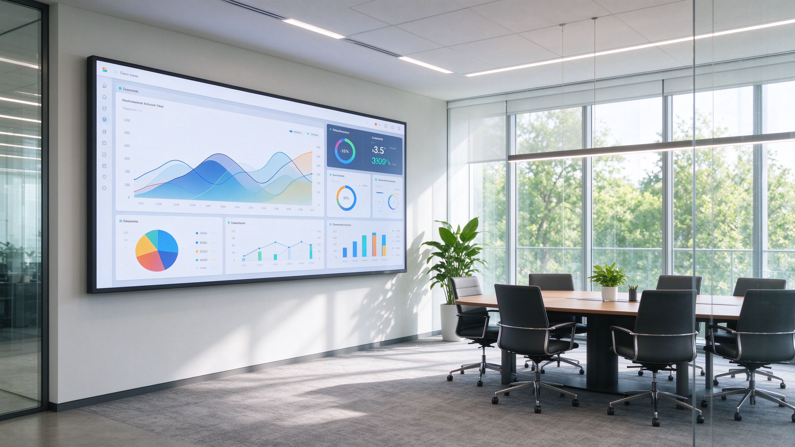
Panels for investment committee, risk review or operations — refreshed weekly, monthly or intraday.
Month-end or quarter-end PDF/HTML briefs with consistent charts and change notes.
Where licence permits, branded summary panels for your own clients — stripped of underlying data.
One-off visualisations for a specific question or internal note, delivered quickly.
A consistent chart language — colours, scales, annotations — so every internal report looks like the same author wrote it.
Each panel ships with a note on source, update frequency and known limitations.
A chart that is poorly scaled, mis-labelled or silently updated is worse than no chart — because it creates false confidence. We treat visualisation as a data-quality problem, not a design exercise. Every panel we build has a documented source, a documented refresh time, and a documented caveat. If a series has known gaps, the panel says so on the face of it.
We also keep our output within the licence constraints of the underlying data. Where a vendor licence permits internal use but not external redistribution, we build accordingly.
Send dashboard requirements and existing data sources. Reply includes a written scope and price.